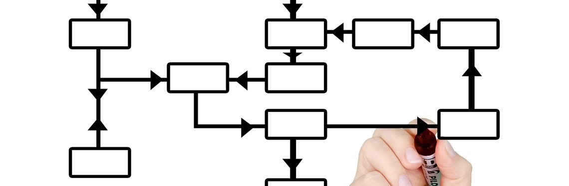
If your website has a lot of content, it can be difficult to decide how best to present it to your users. Designers of sites like Amazon and GOV.UK have spent years perfecting their user journeys so that content is easily accessible from any page on the site.
It is difficult to decide between having information behind multiple organised menus or potentially overwhelming your users with too much information on their landing page. Overloading your users with information will reduce their engagement with the site and make it difficult to hold their attention. Getting it right, however, will increase your site’s usability and keep your users coming back for more!
In this article some UX techniques will be discussed that can help improve the structure of an information-heavy website.
- White space – or alternatively negative space is the portion of the page left blank between images, text and other elements. Even though it is called white space it can be any colour to fit a previous design as long as it doesn’t contain text, images or any other elements. Making use of white space means your content is not everywhere all at the same time, allowing the reader’s eyes rest.
- Meaningful grouping – when deciding how to give your users access to content, it is important to show it to them it in meaningful groups. This can be done by putting content in distinct visual categories and keeping it in a consistent alignment in order to reduce the mental effort required to process the content.
- Search – having a search feature on your website immediately makes it more user-friendly, as users can simply search for what they need using keywords. If your search does not, however, result in the display of intelligible results, then this will reduce the site’s usability and increase frustration with the site.
- Information architecture – deciding on the terminology and importance of different types of content will help before creating the layout of your site.
- Visual hierarchy – after deciding on what content is most important it can be visually shown to users. The relative importance can be implied by size, placement and headings.
Now that we’ve gone through the basics here are some examples for each technique.
- White space: A structured and clean website design allows the content to come through by itself – Google is a good example. Proximity suggests to users certain links have similar function. The less you have on a site the more meaningful the stuff you do have will be. Dmitry Fadeyev found that white space between paragraphs in margins on websites improved comprehension by almost 20 percent online.
- Meaningful grouping: A site which may have different design styles on different pages can still remain consistent with grouping in how it displays content.
- Information hierarchy: Excerpts which summarise your content help users understand where they are looking, thereby increasing usability. Even content which is large in size must be carefully edited to allow for easily digestible paragraphs.
- Visual hierarchy: Bigger content is more noticeable, this is one of the simplest ways to explainto your users that they should take notice of it. Understanding some simple colour psychology will help you create content human eyes are naturally drawn to. Our eyes naturally gravitate towards the centre of a screen however links should be at the side as it is easy to throw a mouse to different corners of a screen.
- Search: Real-time searches allow users to see easily what the website offers.
Eldingo can help by examining your site, creating information architecture, creating and testing prototypes and suggesting the best structure for your site. Or take one of our training courses to set you and your team up for successful testing in-house.